Branding
Branding is a runtime setting, not a build step: changes reach every user on their next page load, with no rebuild or restart required. The brand pack you edit here is what the platform serves to every client on the deployment — there is no per-project or per-user brand.
Edit the brand pack
Section titled “Edit the brand pack”Open Admin › Branding
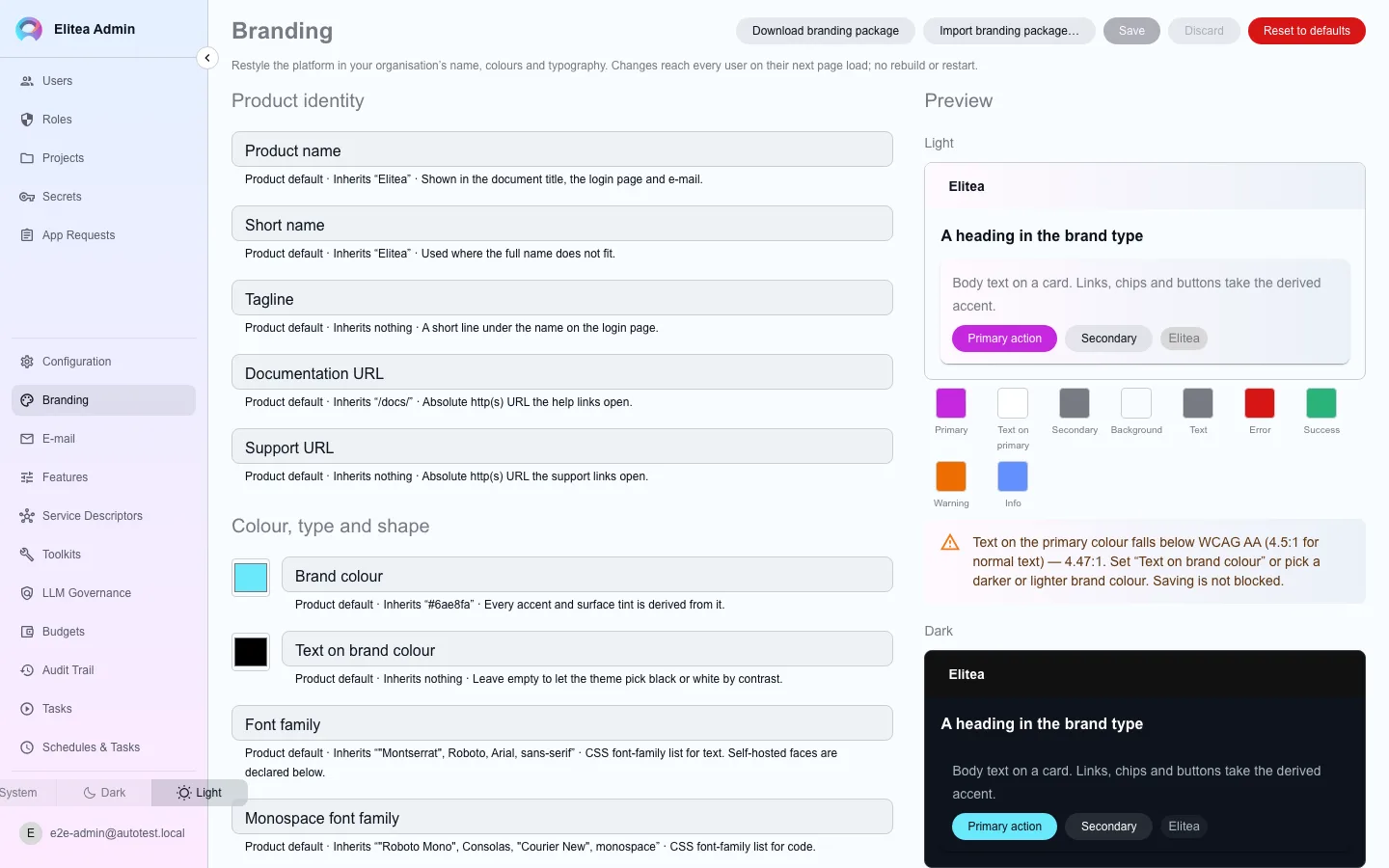
The form is grouped into identity, color/type/shape, assets, and font faces.
Set identity and colors
Every field can inherit from the platform default instead of being set explicitly, and the form says what it would inherit and from where.
Upload assets and declare font faces
Logos and other assets are uploaded directly; self-hosted font faces are declared here rather than linked externally.
Check the preview
A sample surface renders in both light and dark under a theme built from your current draft, including the derived color swatches and a text-on-primary contrast check. The check is a warning only — it does not block saving.
Save
The merged pack becomes what every user’s next page load receives.
Import, export, and restore a package
Section titled “Import, export, and restore a package”Export
Download the current brand as a package.
Import
Uploading a package runs a dry run first, so you see what would change before committing it.
Restore a previous version
Kept versions can be restored from the package panel.
What is inherited by default
Section titled “What is inherited by default”Every branding field defaults to the platform’s own look unless you override it. This means a fresh deployment already looks complete without any editing here — Branding is where you replace that default with your organization’s identity, one field at a time, not something you must fully populate before it is usable.
The default look: Elitea AI
Section titled “The default look: Elitea AI”When you do not set a field, the platform uses the Elitea AI brand (brand guide v3). The full guide is at the Elitea AI brand guide.
| Part | Default |
|---|---|
| Product name | Elitea AI |
| Logo | The LE-03 mark: four rounded bars in cyan, violet, orange and indigo. The full logo adds the “Elitea AI” wordmark. |
| Dark scheme (“Ink”) | Near-black canvas #0B0B18, with lighter surface steps for raised areas. Raised areas do not use shadows. |
| Light scheme (“Paper”) | White canvas #FFFFFF, light grey surfaces and near-black text. |
| Primary colour | Indigo #4A4DE8, with white text, in both schemes. It is the only colour for primary actions. |
| Signal colour | Cyan #00BFE6 on dark for links, focus rings and the active navigation item. On light, the signal colour is indigo, because cyan text on white is not legible. |
| AI colour | Violet #7A5CFF marks AI only, for example model badges. |
| Dot | Orange #FF6B1A is only a small notification or live marker. It is never a text background. |
| Typefaces | Manrope for UI text, Sora for headings and JetBrains Mono for code. The font files are part of the platform, so no external font service is used. |
| Shape | Corner radii of 6, 10 and 14 px, and pill shapes. Keyboard focus shows a 2 px ring in the signal colour, 2 px from the control. |
| Surfaces | Flat. There are no gradients. |
| Sign-in pages and e-mail | The same look: indigo button with white text, Ink or Paper surfaces, the LE-03 logo. |
A hand-tuned scheme token can set the focus colour separately: the token focus.ring holds the ring colour for each scheme (by default the signal colour).