Brand guide · v3.0.0
The Elitea AI brand guide.
Version 3.0.0. The identity of Elitea AI, the unified AI platform: the name, the LE-03 mark, colour, type, voice and the design tokens products read. Written for people and for agents: every rule here is something you can check, and every value comes from one file, tokens.json.
The guide is restraint, not more colour: one primary, signals that each have a single job, and neutrals doing the work.
01
Name
- Write Elitea AI: two words, capital E, "AI" in capitals. Never "EliteaAI", "elitea ai", "ELITEA" or "Elitea.ai".
- Elitea alone is fine in running text once the full name has appeared ("Open Elitea", "Elitea keeps…"), and as the short name where space is tight (app menus, the dock, the home screen).
- Domains are always lowercase: elitea.ai.
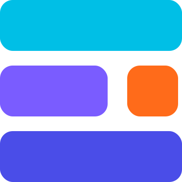
- The mark is LE-03: three stacked layers hinting at an E, the middle layer split into a bar and a dot. It replaced the gradient loop and the gradient orb; both are retired everywhere.
The lockup
The mark plus the wordmark "Elitea AI", set in Sora 700 and supplied as outlines. Use the supplied lockup files and never re-typeset the wordmark. The wordmark takes the text colour of its surface (Ink on Paper, #F2F4FA on Ink); the mark keeps its colours.
- Minimum lockup width: 96 px. Below that, use the mark alone.
- Gap between mark and wordmark: 0.4 × the mark's height. It's built into the file.
02
Logo
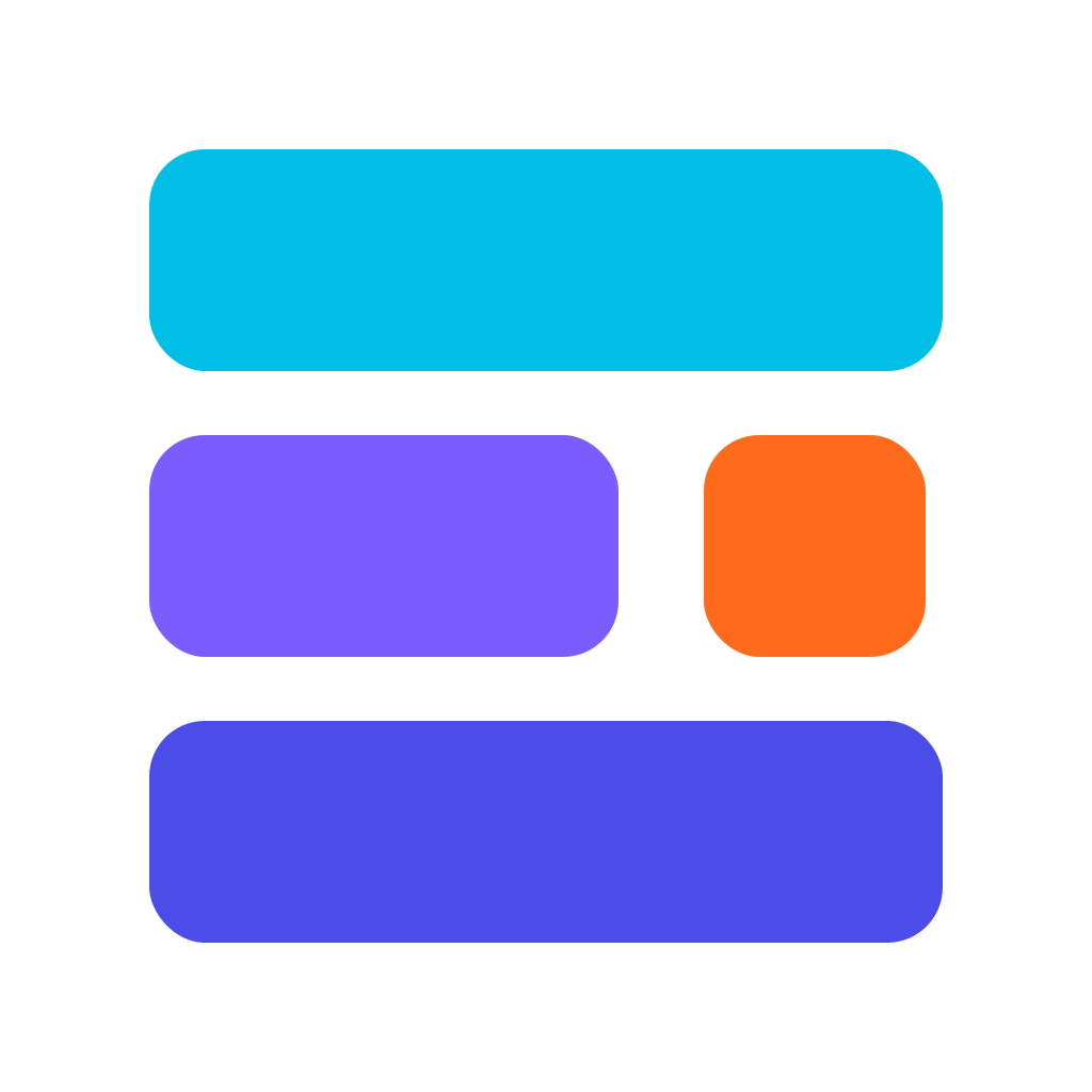
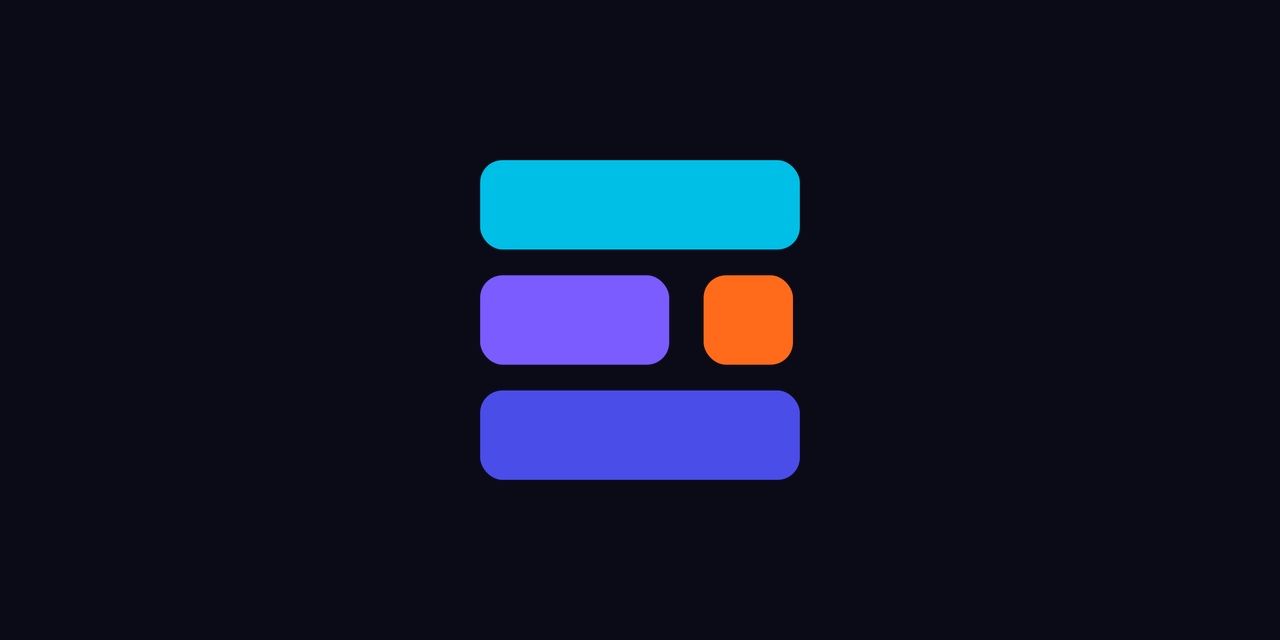
The mark is four flat rounded rectangles on a 372-unit square: Signal Cyan on top, a Layer Violet bar and the Dot Orange square in the middle, Base Indigo at the bottom. The dot is part of the mark, and the only place orange gets to be big.
- Clear space on every side equals one layer's height (104 units, 28% of the mark). No type, edges or other logos inside it.
- Minimum size: 16 px for the mark on screen (favicon), 24 px in UI.
- Variants: coloured (on Ink, Paper or white), one-colour Ink, one-colour white. Nothing else.
- The coloured mark sits only on Ink, Paper or white. Never on cyan, violet, indigo or orange, where its own layers disappear.
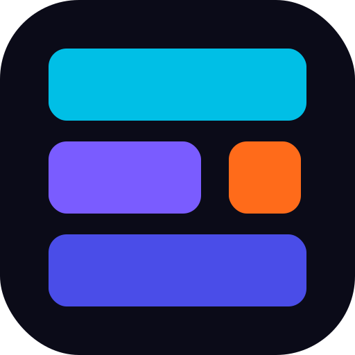
- On photography or busy surfaces, put the mark on a solid Ink or white tile: the app-icon squircle (corner radius 114 on a 512 grid, mark inset 70).
- Never stretch, rotate, outline, shadow, gradient-fill or recolour the layers. Never redraw the geometry; the dot's right edge sits 8 units inside the bars by design.
- The retired gradient loop and gradient orb are not variants. Don't use them anywhere, including "just this once" social posts.
App icons
| Surface | Variant | Notes |
|---|---|---|
| macOS, Windows, desktop dock | coloured on Ink, squircle | elitea-app-icon-1024.png is the master |
| iOS | coloured on Ink, square, opaque | the system rounds the corners |
| Android adaptive | mark foreground on Ink background | monochrome layer = white mark |
| Web favicon | coloured on Ink tile (SVG) | reads on light and dark browser chrome |
| GitHub org / social | coloured on Ink | avatar 1024, social preview 1280×640 |
| macOS menu bar | black mark, template image | the system tints it |
03
Colour
Four colours, taken from the mark in layer order, and each one has exactly one job. These are rules, not suggestions: they stop the product drifting back into a different accent family per theme.
| Colour | Hex | Job |
|---|---|---|
| Base Indigo | #4A4DE8 | The one primary action colour, both themes. |
| Signal Cyan | #00BFE6 | Dark-theme signal: links, focus, active navigation. On light it lives only inside the mark. |
| Layer Violet | #7A5CFF | AI presence only: model badges, AI feature markers. |
| Dot Orange | #FF6B1A | The dot: one notification or live marker per view. |
| Ink | #0B0B18 | Dark canvas and light-theme text. |
| Paper | #FFFFFF | Light canvas and dark-theme on-primary text. |
One colour, one job
- Indigo is the single primary action colour in both themes: buttons, primary actions, selected states, toggles on. White text on it is 5.97:1.
- Cyan is the dark-theme signal: links, active navigation, focus rings on Ink (8.92:1). On light, the signal role is Indigo and cyan appears only inside the mark.
- Violet is the AI accent only: model badges, AI feature markers, assistant presence. Never buttons, never large fills. Text in the AI role uses
aiText. - Orange is the dot only: a notification dot or a live/run marker. At most one per view. Counts and badges are Indigo or danger, never orange. If orange appears twice, it means nothing.
- Neutrals carry the interface. Sidebars, cards, inputs and text are Ink/Paper steps, never tinted brand colour.
- At most two brand hues per screen besides the mark, plus the one orange dot. A screen that needs a third hue has too much happening. Charts are the exception and follow the chart order below.
- Flat fills only. No gradients in UI chrome: no gradient buttons, text, borders, avatars, cards or orbs.
- Semantic colours are not brand colours. Success is green, warning is amber (never orange), danger is red, and each has a per-theme value that passes AA as text.
Proportion
Neutrals about 78%, Indigo 12%, Cyan 5% (dark), Violet 3%, Orange 2%: the dot, almost never.
Charts
Series take, in order: Indigo, Signal (cyan on dark, #0E7490 on light), Violet, then textMuted. Semantic colours only for semantic series (errors, budget exceeded). Never orange.
Banned pairs
| Pair | Ratio | Why |
|---|---|---|
#FFFFFF on #00BFE6 | 2.19:1 | White on cyan, 2.19:1. |
#FFFFFF on #FF6B1A | 2.85:1 | White on orange, 2.85:1. Orange is a dot, not a text background. |
#00BFE6 on #FFFFFF | 2.19:1 | Cyan text on white, 2.19:1. On light, links and focus are indigo. |
#7A5CFF on #FFFFFF | 4.37:1 | Violet body text on white, 4.37:1. Use aiText (#6447F0). |
#22C55E on #FFFFFF | 2.28:1 | Bright green text on white, 2.28:1. Light success is #15803D. |
#F59E0B on #FFFFFF | 2.15:1 | Amber text on white, 2.15:1. Light warning is #B45309. |
#EF4444 on #FFFFFF | 3.76:1 | Red text on white, 3.76:1. Light danger text is #B91C1C. |
Kill list: retired, do not reintroduce
| Retired | Values |
|---|---|
| Lavender wash | #EDEAFA #F0EEFE |
| Magenta accents | #B333D5 #B12ED4 #E04BF0 #C428DD #F47CFF #F551F9 |
| Periwinkle | #6878F8 |
| Muted teal | #284858 #3F7F8A |
| Old pale cyan accent | #6AE8FA #83EFFF |
Also retired: the gradient orb, the rainbow loop logo, gradient text, and any per-theme accent swap. If one of these shows up in a build or a template, it's a bug against this guide.
04
Type
Three families with three jobs. All are SIL Open Font License and self-hosted (no font CDN: the desktop app works offline and the app's font policy is same-origin only).
Elitea AI · type specimen
Agents that do the work.
Data that stays yours.
Create and edit agents and pipelines from the chat. Connect a toolkit, give it credentials, and Elitea keeps everything inside your project.
project_user_1024 · https://elitea.example/llm/v1 · #4A4DE8
| Family | Job | Weights |
|---|---|---|
| Sora | Display and headings, the wordmark | 700, 800 |
| Manrope | Interface and body text | 400, 600 |
| JetBrains Mono | Anything a machine produced or will parse: IDs, URLs, hex, code, eyebrows | 400, 500 |
| Role | Family | Weight | Size | Tracking | Line height |
|---|---|---|---|---|---|
| Display | Sora | 800 | 40-64px | -0.025em | 1.05 |
| Heading | Sora | 700 | 20-36px | -0.02em | 1.15 |
| Body | Manrope | 400 | 14-16px | 0 | 1.55 |
| Label | Manrope | 600 | 13-14px | 0 | 1.4 |
| Eyebrow | JetBrains Mono, uppercase | 500 | 11-12px | 0.16em | 1.4 |
| Code | JetBrains Mono | 400 | 13px | 0 | 1.55 |
- Sentence case everywhere: "Choose the toolkit type", not "Choose The Toolkit Type". Headings, buttons, menu items, tabs.
- Two weights per family, maximum. Hierarchy comes from size and colour role, not five weights competing.
- Uppercase is reserved for mono eyebrows, tracked +0.16em.
05
Voice
Calm, precise and on the user's side. Elitea AI is infrastructure people trust with their data and credentials, and the words should sound like it.
- Plain over playful. Understatement beats exclamation marks.
- Accurate first: name the thing, name what happens next.
- No hype words: "supercharge", "revolutionary", "magic", "10x", "unleash". The pitch is control and competence.
- Empty states name the state and the way out: "No tags yet. Tags you add will appear here." Not "No tags to display."
- Placeholders say what the box does: "Search agents, chats, toolkits…", not "Let's find something amazing!"
- Errors say what happened and what to do, without blame and without exclamation marks: "Couldn't save the toolkit. Check the token and try again."
- No emoji in UI labels.
06
Tokens
Products read these tokens. One token set, same names in both themes: only the neutrals invert, and the brand roles keep their jobs. In the web app they are the default brand pack (apps/elitea-web/src/shared/brand/tokens/default.pack.json); a workspace brand pack (white-label, ADR-0024) replaces them at run time.
| Token | Dark "Ink" | Light "Paper" |
|---|---|---|
bg | #0B0B18 | #FFFFFF |
surface | #12172B | #F4F6FB |
elevated | #1A2036 | #FFFFFF |
border | #232A45 | #E2E6F0 |
borderStrong | #6B7590 | #7C86A0 |
text | #F2F4FA | #0B0B18 |
textMuted | #9AA3B8 | #5A6478 |
textDisabled | #5F6880 | #9AA3B8 |
primary | #4A4DE8 | #4A4DE8 |
primaryHover | #5D60F0 | #3D40D6 |
primaryPressed | #3D40D6 | #3336C0 |
onPrimary | #FFFFFF | #FFFFFF |
signal | #00BFE6 | #4A4DE8 |
onSignal | #0B0B18 | #FFFFFF |
ai | #7A5CFF | #7A5CFF |
aiText | #9A8CFF | #6447F0 |
dot | #FF6B1A | #FF6B1A |
success | #22C55E | #15803D |
warning | #F59E0B | #B45309 |
danger | #F87171 | #B91C1C |
dangerFill | #DC2626 | #DC2626 |
onDangerFill | #FFFFFF | #FFFFFF |
selected | rgba(74, 77, 232, 0.22) | rgba(74, 77, 232, 0.10) |
hover | rgba(242, 244, 250, 0.06) | rgba(11, 11, 24, 0.04) |
scrim | rgba(11, 11, 24, 0.72) | rgba(11, 11, 24, 0.48) |
codeBg | #07070F | #0B0B18 |
codeText | #D9F5FC | #E8EAF6 |
| Token | Value | Use |
|---|---|---|
radiusSm / radiusMd / radiusLg | 6 / 10 / 14 px | chips and small controls / buttons and inputs / cards, dialogs |
| space | 0, 4, 8, 12, 16, 24, 32, 48, 64 | 4 px grid |
| focus ring | 2px signal, 2px offset | every interactive element, both themes |
| motion | 120ms / 200ms, cubic-bezier(0.2, 0, 0, 1) | removed under prefers-reduced-motion |
| elevation (light) | 0 1px 2px rgba(11, 11, 24, 0.06), 0 4px 16px rgba(11, 11, 24, 0.06) | cards, menus, dialogs |
| elevation (dark) | surface steps, no shadow | bg → surface → elevated |
/* Elitea AI design tokens v3.0.0. Generated from tokens.json; https://elitea-ng.github.io/elitea-platform/brand/ */
:root {
  --elitea-indigo: #4A4DE8;
  --elitea-cyan: #00BFE6;
  --elitea-violet: #7A5CFF;
  --elitea-orange: #FF6B1A;
  --elitea-ink: #0B0B18;
  --elitea-paper: #FFFFFF;
  --elitea-font-display: "Sora", "Manrope", system-ui, sans-serif;
  --elitea-font-ui: "Manrope", system-ui, -apple-system, "Segoe UI", Roboto, sans-serif;
  --elitea-font-mono: "JetBrains Mono", ui-monospace, "SF Mono", Consolas, monospace;
  --elitea-radius-sm: 6px;
  --elitea-radius-md: 10px;
  --elitea-radius-lg: 14px;
  --elitea-radius-pill: 9999px;
  --elitea-focus-width: 2px;
  --elitea-focus-offset: 2px;
  --elitea-motion-fast: 120ms;
  --elitea-motion-base: 200ms;
  --elitea-motion-easing: cubic-bezier(0.2, 0, 0, 1);
}
:root,
[data-theme="light"] {
  color-scheme: light;
  --elitea-bg: #FFFFFF;
  --elitea-surface: #F4F6FB;
  --elitea-elevated: #FFFFFF;
  --elitea-border: #E2E6F0;
  --elitea-border-strong: #7C86A0;
  --elitea-text: #0B0B18;
  --elitea-text-muted: #5A6478;
  --elitea-text-disabled: #9AA3B8;
  --elitea-primary: #4A4DE8;
  --elitea-primary-hover: #3D40D6;
  --elitea-primary-pressed: #3336C0;
  --elitea-on-primary: #FFFFFF;
  --elitea-signal: #4A4DE8;
  --elitea-on-signal: #FFFFFF;
  --elitea-ai: #7A5CFF;
  --elitea-ai-text: #6447F0;
  --elitea-dot: #FF6B1A;
  --elitea-success: #15803D;
  --elitea-warning: #B45309;
  --elitea-danger: #B91C1C;
  --elitea-danger-fill: #DC2626;
  --elitea-on-danger-fill: #FFFFFF;
  --elitea-selected: rgba(74, 77, 232, 0.10);
  --elitea-hover: rgba(11, 11, 24, 0.04);
  --elitea-scrim: rgba(11, 11, 24, 0.48);
  --elitea-code-bg: #0B0B18;
  --elitea-code-text: #E8EAF6;
  --elitea-shadow: 0 1px 2px rgba(11, 11, 24, 0.06), 0 4px 16px rgba(11, 11, 24, 0.06);
}
[data-theme="dark"] {
  color-scheme: dark;
  --elitea-bg: #0B0B18;
  --elitea-surface: #12172B;
  --elitea-elevated: #1A2036;
  --elitea-border: #232A45;
  --elitea-border-strong: #6B7590;
  --elitea-text: #F2F4FA;
  --elitea-text-muted: #9AA3B8;
  --elitea-text-disabled: #5F6880;
  --elitea-primary: #4A4DE8;
  --elitea-primary-hover: #5D60F0;
  --elitea-primary-pressed: #3D40D6;
  --elitea-on-primary: #FFFFFF;
  --elitea-signal: #00BFE6;
  --elitea-on-signal: #0B0B18;
  --elitea-ai: #7A5CFF;
  --elitea-ai-text: #9A8CFF;
  --elitea-dot: #FF6B1A;
  --elitea-success: #22C55E;
  --elitea-warning: #F59E0B;
  --elitea-danger: #F87171;
  --elitea-danger-fill: #DC2626;
  --elitea-on-danger-fill: #FFFFFF;
  --elitea-selected: rgba(74, 77, 232, 0.22);
  --elitea-hover: rgba(242, 244, 250, 0.06);
  --elitea-scrim: rgba(11, 11, 24, 0.72);
  --elitea-code-bg: #07070F;
  --elitea-code-text: #D9F5FC;
  --elitea-shadow: none;
}
@media (prefers-color-scheme: dark) {
  :root:not([data-theme="light"]) {
    color-scheme: dark;
    --elitea-bg: #0B0B18;
    --elitea-surface: #12172B;
    --elitea-elevated: #1A2036;
    --elitea-border: #232A45;
    --elitea-border-strong: #6B7590;
    --elitea-text: #F2F4FA;
    --elitea-text-muted: #9AA3B8;
    --elitea-text-disabled: #5F6880;
    --elitea-primary: #4A4DE8;
    --elitea-primary-hover: #5D60F0;
    --elitea-primary-pressed: #3D40D6;
    --elitea-on-primary: #FFFFFF;
    --elitea-signal: #00BFE6;
    --elitea-on-signal: #0B0B18;
    --elitea-ai: #7A5CFF;
    --elitea-ai-text: #9A8CFF;
    --elitea-dot: #FF6B1A;
    --elitea-success: #22C55E;
    --elitea-warning: #F59E0B;
    --elitea-danger: #F87171;
    --elitea-danger-fill: #DC2626;
    --elitea-on-danger-fill: #FFFFFF;
    --elitea-selected: rgba(74, 77, 232, 0.22);
    --elitea-hover: rgba(242, 244, 250, 0.06);
    --elitea-scrim: rgba(11, 11, 24, 0.72);
    --elitea-code-bg: #07070F;
    --elitea-code-text: #D9F5FC;
    --elitea-shadow: none;
  }
}
07
Accessibility
Every text pair below is measured (WCAG 2.2 relative luminance), not guessed; the build and the test suite recompute them from tokens.json and fail when one drops below its minimum.
| Theme | Pair | Ratio | Minimum | Verdict |
|---|---|---|---|---|
| Dark | text #F2F4FA on bg #0B0B18 | 17.76:1 | 4.5:1 | AAA |
| Light | text #0B0B18 on bg #FFFFFF | 19.53:1 | 4.5:1 | AAA |
| Dark | text #F2F4FA on surface #12172B | 16.14:1 | 4.5:1 | AAA |
| Light | text #0B0B18 on surface #F4F6FB | 18.06:1 | 4.5:1 | AAA |
| Dark | text #F2F4FA on elevated #1A2036 | 14.65:1 | 4.5:1 | AAA |
| Light | text #0B0B18 on elevated #FFFFFF | 19.53:1 | 4.5:1 | AAA |
| Dark | textMuted #9AA3B8 on bg #0B0B18 | 7.72:1 | 4.5:1 | AAA |
| Light | textMuted #5A6478 on bg #FFFFFF | 5.95:1 | 4.5:1 | AA |
| Dark | textMuted #9AA3B8 on surface #12172B | 7.02:1 | 4.5:1 | AAA |
| Light | textMuted #5A6478 on surface #F4F6FB | 5.50:1 | 4.5:1 | AA |
| Dark | textMuted #9AA3B8 on elevated #1A2036 | 6.37:1 | 4.5:1 | AA |
| Light | textMuted #5A6478 on elevated #FFFFFF | 5.95:1 | 4.5:1 | AA |
| Dark | onPrimary #FFFFFF on primary #4A4DE8 | 5.97:1 | 4.5:1 | AA |
| Light | onPrimary #FFFFFF on primary #4A4DE8 | 5.97:1 | 4.5:1 | AA |
| Dark | onPrimary #FFFFFF on primaryHover #5D60F0 | 4.78:1 | 4.5:1 | AA |
| Light | onPrimary #FFFFFF on primaryHover #3D40D6 | 7.23:1 | 4.5:1 | AAA |
| Dark | onPrimary #FFFFFF on primaryPressed #3D40D6 | 7.23:1 | 4.5:1 | AAA |
| Light | onPrimary #FFFFFF on primaryPressed #3336C0 | 8.64:1 | 4.5:1 | AAA |
| Dark | signal #00BFE6 on bg #0B0B18 | 8.92:1 | 4.5:1 | AAA |
| Light | signal #4A4DE8 on bg #FFFFFF | 5.97:1 | 4.5:1 | AA |
| Dark | signal #00BFE6 on surface #12172B | 8.11:1 | 4.5:1 | AAA |
| Light | signal #4A4DE8 on surface #F4F6FB | 5.52:1 | 4.5:1 | AA |
| Dark | signal #00BFE6 on elevated #1A2036 | 7.36:1 | 4.5:1 | AAA |
| Light | signal #4A4DE8 on elevated #FFFFFF | 5.97:1 | 4.5:1 | AA |
| Dark | onSignal #0B0B18 on signal #00BFE6 | 8.92:1 | 4.5:1 | AAA |
| Light | onSignal #FFFFFF on signal #4A4DE8 | 5.97:1 | 4.5:1 | AA |
| Dark | aiText #9A8CFF on bg #0B0B18 | 7.04:1 | 4.5:1 | AAA |
| Light | aiText #6447F0 on bg #FFFFFF | 5.67:1 | 4.5:1 | AA |
| Dark | aiText #9A8CFF on elevated #1A2036 | 5.81:1 | 4.5:1 | AA |
| Light | aiText #6447F0 on elevated #FFFFFF | 5.67:1 | 4.5:1 | AA |
| Dark | ai #7A5CFF on bg #0B0B18 | 4.47:1 | 3:1 | Non-text |
| Light | ai #7A5CFF on bg #FFFFFF | 4.37:1 | 3:1 | Non-text |
| Dark | success #22C55E on bg #0B0B18 | 8.57:1 | 4.5:1 | AAA |
| Light | success #15803D on bg #FFFFFF | 5.02:1 | 4.5:1 | AA |
| Dark | success #22C55E on surface #12172B | 7.79:1 | 4.5:1 | AAA |
| Light | success #15803D on surface #F4F6FB | 4.64:1 | 4.5:1 | AA |
| Dark | warning #F59E0B on bg #0B0B18 | 9.09:1 | 4.5:1 | AAA |
| Light | warning #B45309 on bg #FFFFFF | 5.02:1 | 4.5:1 | AA |
| Dark | warning #F59E0B on surface #12172B | 8.26:1 | 4.5:1 | AAA |
| Light | warning #B45309 on surface #F4F6FB | 4.64:1 | 4.5:1 | AA |
| Dark | danger #F87171 on bg #0B0B18 | 7.06:1 | 4.5:1 | AAA |
| Light | danger #B91C1C on bg #FFFFFF | 6.47:1 | 4.5:1 | AA |
| Dark | danger #F87171 on surface #12172B | 6.42:1 | 4.5:1 | AA |
| Light | danger #B91C1C on surface #F4F6FB | 5.98:1 | 4.5:1 | AA |
| Dark | danger #F87171 on elevated #1A2036 | 5.82:1 | 4.5:1 | AA |
| Light | danger #B91C1C on elevated #FFFFFF | 6.47:1 | 4.5:1 | AA |
| Dark | onDangerFill #FFFFFF on dangerFill #DC2626 | 4.83:1 | 4.5:1 | AA |
| Light | onDangerFill #FFFFFF on dangerFill #DC2626 | 4.83:1 | 4.5:1 | AA |
| Dark | borderStrong #6B7590 on bg #0B0B18 | 4.25:1 | 3:1 | Non-text |
| Light | borderStrong #7C86A0 on bg #FFFFFF | 3.64:1 | 3:1 | Non-text |
| Dark | borderStrong #6B7590 on surface #12172B | 3.86:1 | 3:1 | Non-text |
| Light | borderStrong #7C86A0 on surface #F4F6FB | 3.36:1 | 3:1 | Non-text |
| Dark | borderStrong #6B7590 on elevated #1A2036 | 3.51:1 | 3:1 | Non-text |
| Light | borderStrong #7C86A0 on elevated #FFFFFF | 3.64:1 | 3:1 | Non-text |
| Dark | codeText #D9F5FC on codeBg #07070F | 17.60:1 | 4.5:1 | AAA |
| Light | codeText #E8EAF6 on codeBg #0B0B18 | 16.30:1 | 4.5:1 | AAA |
- Focus is always visible: a 2 px ring in
signalwith a 2 px offset in the page colour. The offset matters on light, wheresignalandprimaryare the same Indigo: a ring flush on an Indigo button would vanish. - Control boundaries use
borderStrong(3:1 or better against every surface, WCAG 1.4.11). Hairlineborderis for dividers only, never the only edge of an input. - Indicators on dark surfaces: Indigo on
surfaceis 2.97:1, under the 3:1 non-text bar. A selected nav item therefore pairs the Indigo fill with white text, or uses asignalindicator bar; a toggle's "on" state relies on its white thumb, not the track alone. - Never colour alone: status carries an icon or a word as well as a hue.
- Interactive targets are at least 24 × 24 px.
- Motion is removed under
prefers-reduced-motion: reduce.
08
Guardrails
Always
- One primary: Indigo in both themes, for every primary action.
- Let neutrals carry the interface; reach for a brand hue only when it has its one job to do.
- Before shipping a screen: at most two brand hues besides the mark, orange at most once.
- Use the supplied mark files and tokens. Never redraw, recolour or re-tokenise locally.
- Warnings in amber, errors in red: semantic colours, per-theme values.
Never
- Reintroduce a kill-list colour.
- Use a banned pair.
- Put a gradient in UI chrome.
- Make orange a button, a warning, a badge or a large fill. It's the dot.
- Swap the accent family per theme. Dark and light are one system; only neutrals invert.
09
For agents
This guide is built to be read by machines as well as people. If you are an agent producing anything that carries the Elitea AI brand (UI, a slide, a page, an e-mail, a diagram):
- Read this file,
BRAND.md, first.llms.txtindexes every resource here. - Take colours, type and radii from
tokens.json(W3C design-token format) ortokens.css(--elitea-*custom properties, light by default, dark under[data-theme="dark"]or the system preference). Never sample colours from screenshots. - Use the logo files under
assets/as they are. The coloured mark needs Ink, Paper or white behind it. - Check your output against section 08: one primary, at most two brand hues, orange once, no gradients, no kill-list colours, sentence case, AA contrast.
- In the Elitea platform repository the canonical sources are
libs/ts/client-core/src/brand/(tokens.json,logo-mark.svg,logo-full.svg). Edit there and runnode libs/ts/client-core/scripts/gen-brand.mjs. Never edit a generated copy.
10
Changes from v2
The v2 proposal was reviewed against WCAG 2.2, the running product and its own rules before it became this guide. The decisions it made stand; these are the gaps that were closed.
- Semantic colours failed as text on light. Success
#22C55E(2.28:1), warning#F59E0B(2.15:1) and danger#EF4444(3.76:1) on white fail AA. Light now uses#15803D,#B45309and#B91C1C; dark keeps the bright values, with danger raised to#F87171(#EF4444is 4.28:1 onelevated). - White on danger fails (3.76:1). Destructive buttons use
dangerFill#DC2626(4.83:1) in both themes. - Input borders were invisible to the contrast rule.
#E2E6F0on white is 1.25:1 and#232A45on Ink 1.38:1, against the 3:1 that WCAG 1.4.11 asks of a control's edge. AddedborderStrong. - The focus ring vanished on light primary buttons, because
signal=primary= Indigo there. The ring now has a 2 px offset. - Violet text was below AA in both themes (4.37:1 on white, 4.47:1 on Ink). Added
aiText:#6447F0on light,#9A8CFFon dark. - Indigo indicators on dark surfaces (2.97:1 on
surface) now have a written rule. - States were missing: hover, pressed, disabled, selected, scrim and code tokens were added, all measured.
- Internal contradictions were resolved: "two weights per family" against a scale that used three Manrope weights; a 96 px lockup minimum against "below 24 px, drop the wordmark"; eyebrow tracking given as both 0.22em and 0.16em; 16.5 px body text against a 13–16 px scale.
- Fonts came from a CDN. They are now self-hosted, because the app's policy is same-origin only and the desktop app must work offline.
- Missing foundations were added: spacing, motion, elevation, chart order and icon-surface rules, so that agents don't have to invent them.
- Personal and sample data was removed: reviewer names, a real project id and a city.
11
Downloads
- Logo: mark, coloured · mark, one-colour Ink · mark, one-colour white · app icon (SVG)
- Lockup: on light · on dark
- App icon PNG: coloured on Ink, 1024 · coloured, transparent, 1024 · one-colour, 1024 · white on Ink, 1024 · Windows .ico · GitHub social preview
- Tokens: tokens.css · tokens.json
- Fonts (OFL): Sora · Manrope · JetBrains Mono
- This guide as Markdown: BRAND.md